Annual, Impact & Sustainability Report Design
Izgi Uygur Studio designs annual, impact, and sustainability reports for nonprofits, foundations, sustainability teams, and mission-driven companies. From narrative structure and data visualization to editorial design and final files.
- Harvard University
- MIT
- City of Cambridge
- City of Miami Beach
- NC State University
- Mass Audubon
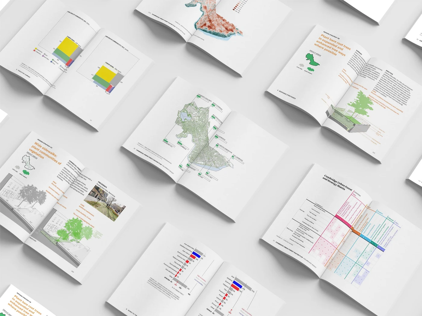
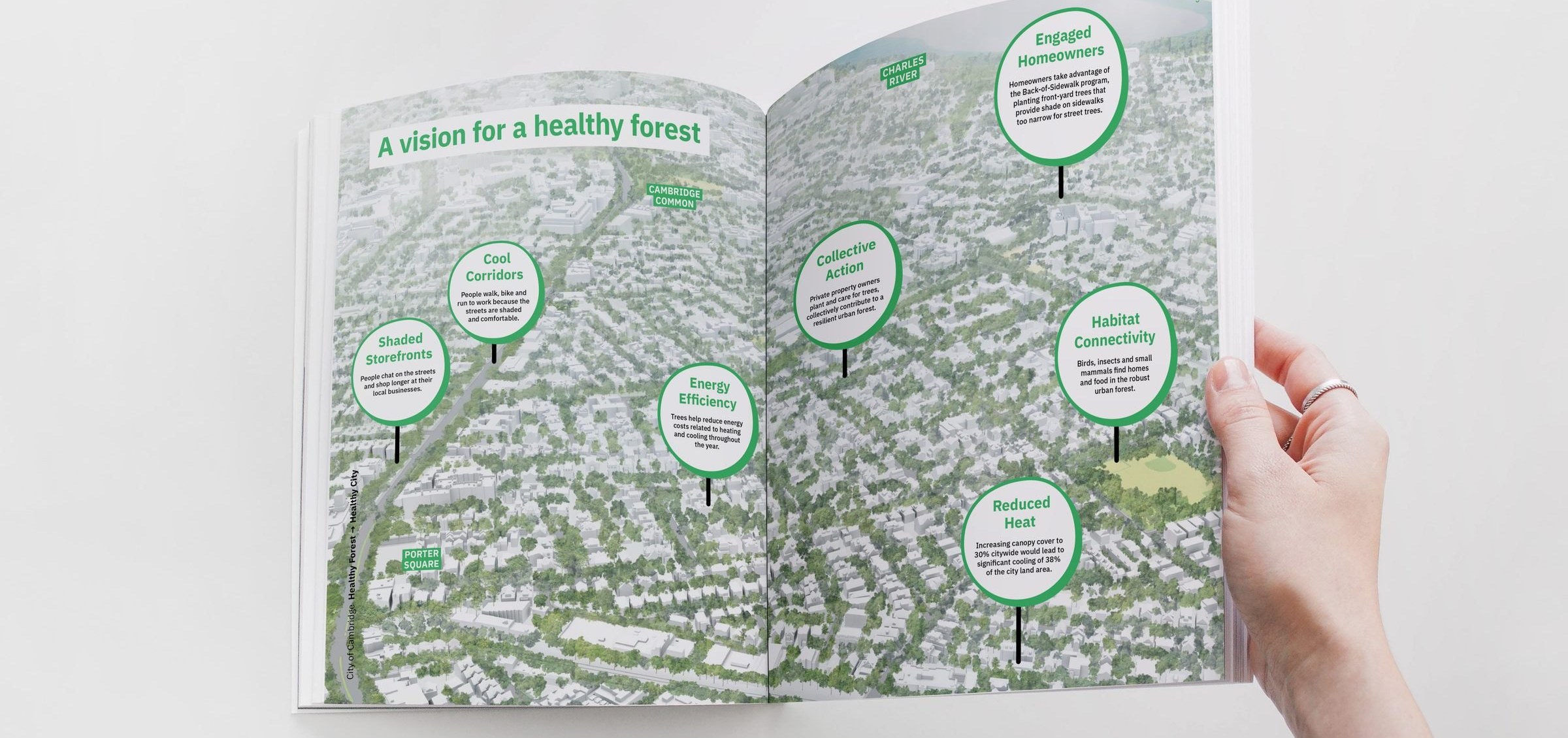
Cambridge Urban Forest Master Plan
A 264-page technical plan turned into a public summary report, with the canopy data redrawn so residents and city staff could follow the same argument.
View project →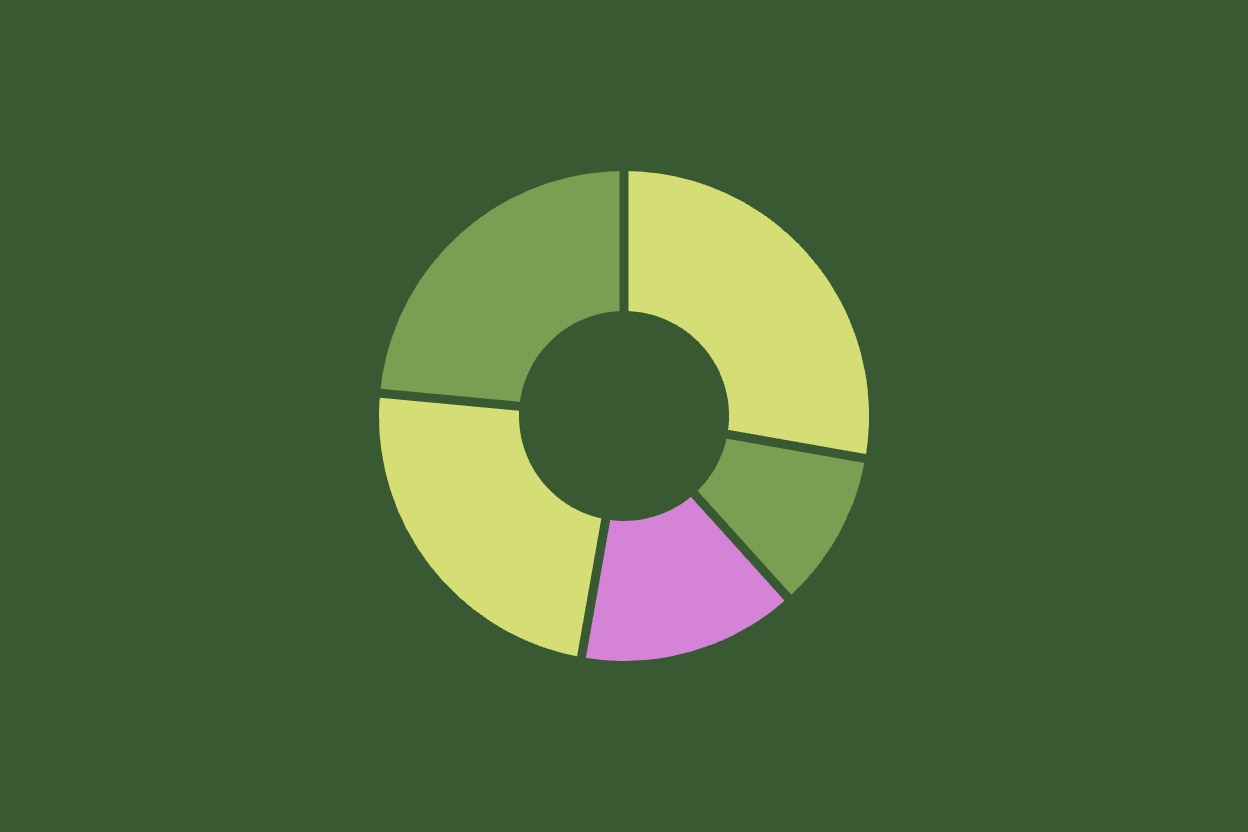
Vassar Streetscape Conditions Report
A field survey of about 130 street trees turned into a 41-page conditions report, with one rating system drawn so a whole street reads at a glance.
View project →Annual Reports
Narrative structure, editorial design, data visualization, print and digital files.
Impact & Sustainability Reports
Metrics, stories, infographics, charts, and a clear visual system.
Research & Technical Reports
Complex findings, datasets, maps, diagrams, and recommendations made easier to navigate.
Understand
Content, audience, goals, brand, data.
Structure & Design
Narrative, hierarchy, visuals, key pages.
Refine & Deliver
Review, final design, production files.
Can you start before the report content is final?
Yes, and it usually works better that way. I can structure the narrative and build the visual system from a draft or an outline, then place final copy and numbers as they arrive.
Can you work with spreadsheets and raw data?
Yes. Send what you have, whether that is spreadsheets, database exports, or survey results. I structure the data first, then design the charts from it.
Do you prepare files for both print and digital use?
Yes. You get print-ready files for your printer and a screen-optimized PDF for the web, plus editable source files or templates when you want to update the report yourself.
Have a report in progress?
Even if the content isn't finished yet.